
R: Time Series Forecasting with Traditional & Modern Methods
Background
There are plenty of methods used to forecast a time series. While data characteristics can help point you toward an optimal model, it’s important to weigh the pros and cons of any approach you choose. Traditional models like ARIMA and exponential smoothing have long been favored for their robustness and simplicity. Meanwhile, newer models can offer simplified implementation and improved performance on complex datasets. So, where is the best place to begin?
Using daily sales from a Superstore dataset, we’ll explore traditional forecasting methods and compare their accuracy. We’ll then shift our focus to Facebook’s 2017 forecasting model, Prophet, and see how it measures up. This data was sourced from Kaggle – a platform that hosts a rich collection of real-world datasets. All plots and data manipulation will be executed using R.
“Traditional” Time Series Modeling
Let’s begin by loading our Superstore data into RStudio and formatting a time series dataframe.
# Load in Superstore data from Kaggle
library(readr)
superstore <- read_csv("R Studio Projects/R Datasets/Sample - Superstore.csv")

# Install libraries for aggregating sales & profit data
library(dplyr)
library(lubridate)

# Convert "Order Date" to date format
superstore$`Order Date` = as.Date(superstore$`Order Date`, format="%m/%d/%Y")

# Group by "Order Date" and aggregate sales and profit
sales_profit = superstore %>%
  group_by(`Order Date`) %>%
  summarize(Total_Sales = sum(Sales, na.rm = TRUE),
            Total_Profit = sum(Profit, na.rm = TRUE))

# Change variable name
names(sales_profit)[1]="Order_Date"

# Display the first few rows of the new dataframe
head(sales_profit)
| Order_Date | Total_Sales | Total_Profit |
|---|---|---|
| 2014-01-03 | 16.4 | 5.55 |
| 2014-01-04 | 288.0 | -66.0 |
| 2014-01-05 | 19.5 | 4.88 |
| 2014-01-06 | 4407.0 | 1358.0 |
| 2014-01-07 | 87.2 | -72.0 |
| 2014-01-09 | 40.5 | 10.9 |
Our data was collected from January 2014 to December 2017. For each day in the series, we have a value for total sales and total profit. We will only focus on total sales for now. Let’s look for any seasonality or trends present in the data.
# Plot sales time series
library(ggplot2)
ggplot(sales_profit, aes(x = Order_Date, y = Total_Sales)) +
  geom_line(color = "blue") +
  labs(title = "Time Series of Total Sales",
       x = "Order Date",
       y = "Total Sales") +
  theme_minimal()
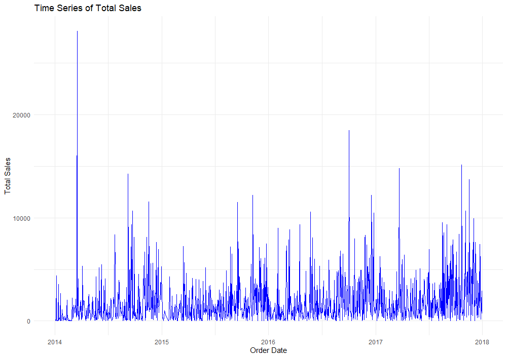
Our plot of total sales shows a slight positive trend over time. We can also observe signs of seasonality in the data with sales spiking at various times of the year. This is to be expected. Shopping habits often shift due to holidays, promotional events, market conditions, and other factors.
A time series is considered stationary if its expected value, autocorrelation, and variance remain constant over time. When models are used to forecast a non-stationary time series, their predictions often lack accuracy. This is because they struggle to detect underlying patterns in the data like trends and seasonality. Due to our observations in the plot above, it’s quite likely our time series is non-stationary. We will use an Autocorrelation Function (ACF) and Partial Autocorrelation Function (PACF) to test for stationarity in the data.
- The ACF measures the correlation between data points in a time series and their past values across various lags, capturing both direct and indirect correlations. It helps us understand recurring patterns or cycles in the data.
- The PACF measures the direct correlation between a time series and its lagged values while excluding the effects of any intermediate lags. It helps identify the specific lag relationship that contributes to the correlation.
Typically, graphing the ACF and PACF of a stationary time series will show a rapid decline in correlation as lags increase. This rapid decline indicates that past values have little to no influence on future values beyond a certain point.
Let’s take a look at the ACF and PACF of our sales data to explore stationarity before forecasting.
# Check stationarity by plotting ACF and PACF
library(forecast)
par(mfrow = c(2, 1)) # Arrange top and bottom plots
acf(sales_profit$Total_Sales, main = "ACF of Total Sales")
pacf(sales_profit$Total_Sales, main = "PACF of Total Sales")
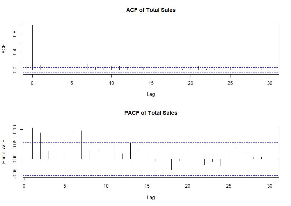
The blue dashed lines in both plots represent a 95% confidence interval. Values that fall outside of these bounds indicate statistically significant correlations that may need to be accounted for in the model. In our first plot, the ACF does decline quickly, but there are several significant spikes beyond lag 5. There are also several PACF values beyond lag 5 that are significantly different from zero. These plots further indicate our time series is non-stationary…
The most common way to achieve stationarity is through a method called differencing. Differencing involves subtracting the previous observation from the current observation in an effort to stabilize the mean and variance of a time series. This is calculated using the following formula:
ΔYt = Yt - Yt-1
Where ΔYt is the first difference, Yt is the current observation, and Yt-1 is the previous observation.
Luckily, the diff function in R will calculate the first difference of our time series for us.
# Calculate the first difference of Total Sales
diff_total_sales = diff(sales_profit$Total_Sales, differences = 1)

# Create a new data frame for the differenced series
diff_sales_profit = sales_profit[-1, ] # Removes first row to match first-difference dimensions
diff_sales_profit$Diff_Total_Sales = diff_total_sales

# Plot the differenced time series for total sales
ggplot(diff_sales_profit, aes(x = Order_Date, y = Diff_Total_Sales)) +
  geom_line(color = "blue") +
  labs(title = "Differenced Time Series of Total Sales",
       x = "Order Date",
       y = "Differenced Total Sales") +
  theme_minimal()
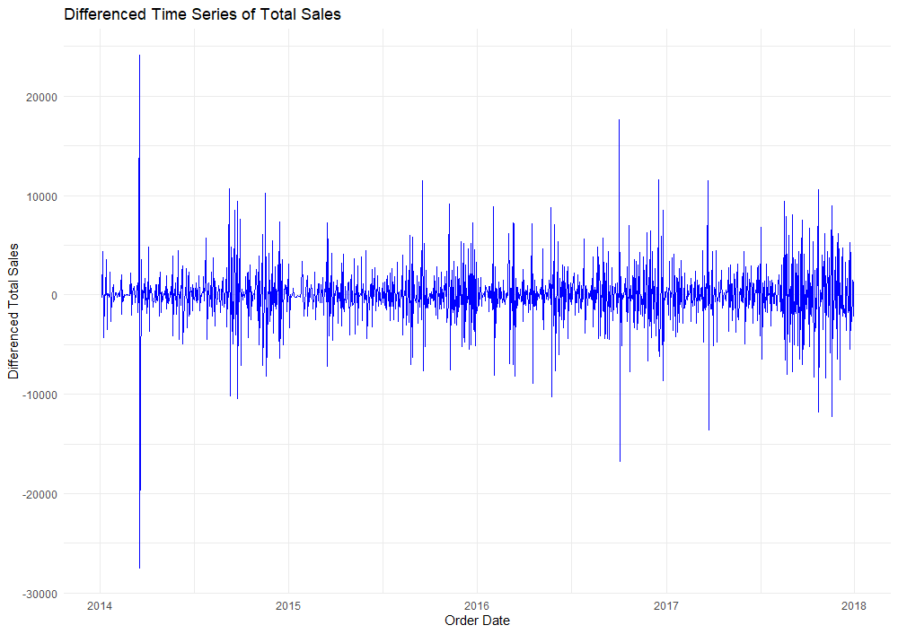
The mean of this new plot now appears to be around zero, indicating that differencing has removed most of the trend component. Compared to our original plot, the variation in the differenced series is slightly more consistent over time. This suggests that differencing also helped stabilize the variance as we had hoped!
Next, using the Augmented Dicky-Fuller Test, we will test for stationarity in the first-differenced time series. The ADF test evaluates a null hypothesis that a unit root is present in the time series. If the p-value of this test falls below 0.05, we can reject the null hypothesis. This would suggest that the series is stationary.
# Test stationarity using the Augmented Dickey-Fuller Test
library(tseries)
adf.test(diff_sales_profit$Total_Sales) # Significant p-value suggests differenced series is stationary

 ------------------------------------------------------------
	Augmented Dickey-Fuller Test

data:  diff_sales_profit$Total_Sales
Dickey-Fuller = -8.1878, Lag order = 10, p-value = 0.01
alternative hypothesis: stationary
A p-value of 0.01 tells us that our differenced time series is now stationary. Once more, we’ll look at the ACF and PACF plots of our differenced series.
.png)
As we can see, plots of the ACF and PACF show a decline in correlation as lags increase. Significant spikes up to lag 20 in the PACF suggest direct correlations at these lags. While differencing made our series stationary, there are still specific lag dependencies that should be considered in model selection.
Like the title of this section suggests, we’ll be looking at more “traditional” forecasting methods to predict future sales. These models have been used in time series forecasting for quite some time.
-
AR(p): The Autoregressive model uses a linear combination of lags to predict future values. The parameter value p represents the number of lagged observations used in the model formula (I won’t dive into the calculations here). AR models are most beneficial when a time series has a strong correlation with its past values.
-
MA(q): The Moving Average model uses previous forecasting errors to make predictions. The parameter q indicates the number of lagged forecasting errors considered by the model. MA models are useful when forecasting errors are highly correlated over time.
-
ARIMA(p,d,q): The AutoRegressive Integrated Moving Average model combines elements of the AutoRegressive (AR) model, Moving Average (MA) model, and differencing. ARIMA models are the most versatile for handling real-world data. This is because data is often non-stationary and requires some degree of differencing.
Because we already differenced our sales time series, we will focus our attention on the ARIMA(p,d,q) model with d=1. We can use the following rules to determine p and q.
- If the ACF declines quickly to zero as lags increase and the PACF has significant spikes at lags 1 to p, an AR(p) model should be considered.
- If the ACF has significant spikes at lags 1 to q and the PACF declines quickly to zero, an MA(q) model should be considered.
Looking back at the ACF and PACF plots of the first-differenced series, the ACF had a single significant spike at lag 1, and the PACF spikes declined quickly to zero. Thus, we determine a value of 1 for q and consider an ARIMA(0,1,1) model to forecast our original sales data.
# Fit ARIMA(0,1,1) model
sales_arima_model <- arima(sales_profit$Total_Sales, c(0,1,1)) # Assign vector for p, d, q

# Summarize the model
summary(sales_arima_model)

 ------------------------------------------------------------
Call:
arima(x = sales_profit$Total_Sales, order = c(0, 1, 1))

Coefficients:
          ma1
      -0.9641
s.e.   0.0098

sigma^2 estimated as 5107288:  log likelihood = -11300.87,  aic = 22605.75

Training set error measures:
                   ME     RMSE      MAE      MPE     MAPE      MASE       ACF1
Training set 52.00244 2259.017 1487.412 -866.918 897.8833 0.7558027 0.03421496
The model diagnostics calculated above using the summary function will be useful later when comparing the performance of alternative forecasting models. Next, we will check the residuals (error terms) of our ARIMA(0,1,1) model to see if they are random. We would like our residuals to follow a white noise distribution.
ϵt ∼ WN(0,σ2)
White noise (WN) has a mean of zero, a constant variance, and no autocorrelation between residuals at different lags.
# Plot residual diagnostics
checkresiduals(sales_arima_model)
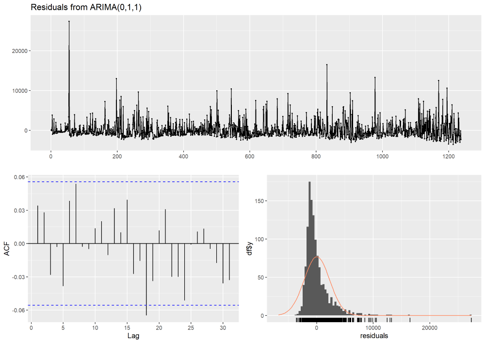
In the top plot, we see our model residuals over time. Ideally, these residuals should fluctuate around zero with no clear pattern. While the residuals are mostly centered around zero, there are some large spikes. These spikes likely indicate outliers or periods where the model did not fit the data well. In the bottom left, an ACF plot of residuals reveals one significant autocorrelation at lag 18. While there could be a pattern in the residuals that the model has not captured, it’s likely due to random variation. In the bottom right, we see a distribution of residuals that are mostly centered at zero (with the exception of a few large outliers). The ARIMA(0,1,1) model seems to have captured the general pattern of the data well.
Additionally, we can perform the Ljung-Box Test to check for significant autocorrelation in the residuals of the model. This test helps determine whether the residuals are independently distributed. A p-value less than 0.05 would indicate significant autocorrelation in residuals.
# Ljung-Box Test
res = residuals(sales_arima_model)
box_ljung_test = Box.test(res, lag = 20, type = "Ljung-Box")
print(box_ljung_test)

------------------------------------------------------------
Box-Ljung test

data:  res
X-squared = 23.103, df = 20, p-value = 0.2838
With a p-value of 0.2838, we fail to reject the null hypothesis and assume there is no significant autocorrelation in the residuals.
Now that we’ve selected an ARIMA model, let’s see how it compares to the model that R’s auto.arima function identifies as the best fit. This function automatically fits ARIMA parameters on the original time series.
# Check if proposed model matches auto.arima() function
test_arima = auto.arima(sales_profit$Total_Sales)

summary(test_arima) # also proposes ARIMA(0,1,1)

------------------------------------------------------------
Series: sales_profit$Total_Sales
ARIMA(0,1,1)

Coefficients:
          ma1
      -0.9641
s.e.   0.0098

sigma^2 = 5111424:  log likelihood = -11300.87
AIC=22605.75   AICc=22605.76   BIC=22615.98

Training set error measures:
                   ME     RMSE      MAE      MPE     MAPE      MASE       ACF1
Training set 52.00244 2259.017 1487.412 -866.918 897.8833 0.7558027 0.03421496
This function also selected an ARIMA(0,1,1) model!
Let’s try comparing our ARIMA model to some other approaches. First, we will consider an Exponential Smoothing State Space (ETS) model. ETS models can be a good alternative when forecasting time series with trends and seasonality. These models include components for error, trend, and seasonality…
# Construct an ETS model
sales_ets_model = ets(sales_profit$Total_Sales)
summary(sales_ets_model)
------------------------------------------------------------
ETS(A,N,N)

Call:
ets(y = sales_profit$Total_Sales)

  Smoothing parameters:
    alpha = 0.0346

  Initial states:
    l = 852.6856

  sigma:  2260.831

     AIC     AICc      BIC
27919.90 27919.92 27935.26

Training set error measures:
                   ME     RMSE     MAE       MPE     MAPE      MASE       ACF1
Training set 49.49787 2259.002 1489.77 -881.6218 912.3988 0.7570005 0.03535812
As we compare ARIMA to ETS, we see the following.
- Mean Error (ME): Both models have similar ME values, with the ETS model showing a slightly smaller ME (49.50) compared to the ARIMA model (52.00). This indicates that both models have similar levels of bias, though the ETS model may be slightly better.
- Mean Absolute Error (MAE): Both models have comparable MAE values (1487.77 for ETS and 1487.41 for ARIMA). This indicates that both models have very similar predictive performance.
- Mean Percentage Error (MPE): On average, both models tend to under-predict the true value of daily sales. The ETS model has a more negative MPE (-881.62) compared to the ARIMA model (-866.92), indicating the ETS model shows slightly greater under-prediction.
- Mean Absolute Percentage Error (MAPE): The ARIMA model has a slightly lower MAPE (897.88) compared to the ETS model (912.40). This indicates that the ARIMA model might have a slight edge in terms of percentage error.
- AIC, AICc, BIC: The ARIMA model has significantly lower AIC (22605.75), AICc (22605.76), and BIC (22615.98) values compared to the ETS model (AIC = 27919.00, AICc = 27919.92, BIC = 27935.26). Lower values for these criteria generally indicate a better fit, so the ARIMA model is preferred based on these measures.
In summary, the ARIMA and ETS models share similar performance in terms of error measures (ME, RMSE, MAE, MPE, MAPE, and MASE). ACF1 values tell us the residuals’ autocorrelation is minimal in both models, indicating they both handle the data’s autocorrelation well. However, the ARIMA model has a slight edge with lower AIC, AICc, and BIC values. These lower values suggest that the ARIMA model provides a better fit to the data. Thus, the ARIMA model remains the preferred choice!
We’ll introduce one last “traditional” model as a challenger: the Seasonal Naive (SNAIVE) model. The SNAIVE model is a simple yet effective forecasting approach that assumes the value of a time series at a given period is equal to the value from the same period in the previous season. By leveraging seasonality, this model can often provide surprisingly accurate forecasts when underlying patterns are consistent and strong.
# Construct a SNAIVE model
sales_snaive_model = snaive(sales_profit$Total_Sales)
summary(sales_snaive_model)

------------------------------------------------------------
Forecast method: Seasonal naive method

Model Information:
Call: snaive(y = sales_profit$Total_Sales)

Residual sd: 3083.6947

Error measures:
                    ME     RMSE     MAE       MPE     MAPE MASE       ACF1
Training set 0.5641926 3083.695 1967.99 -692.8012 755.9121    1 -0.4961512

Forecasts:
     Point Forecast     Lo 80    Hi 80     Lo 95    Hi 95
1238         713.79 -3238.124 4665.704 -5330.141 6757.721
1239         713.79 -4875.060 6302.640 -7833.619 9261.199
Rather than summarizing the SNAIVE model in another head-to-head comparison with ARIMA(0,1,1), we will compare all three models in a model diagnostics table below.
| Diagnostic Metric | ARIMA(0,1,1) | SNAIVE | ETS | Better Model |
|---|---|---|---|---|
| Mean Error (ME) | 52.00 | 0.564 | 49.50 | SNAIVE / ETS |
| Root Mean Squared Error (RMSE) | 2259.017 | 3083.695 | N/A | ARIMA |
| Mean Absolute Error (MAE) | 1487.412 | 1967.99 | 1487.77 | ARIMA |
| Mean Percentage Error (MPE) | -866.92 | -692.80 | -881.62 | ARIMA |
| Mean Absolute Percentage Error (MAPE) | 897.88 | 755.91 | 912.40 | ARIMA |
| Mean Absolute Scaled Error (MASE) | 0.7558 | 1.0 | N/A | ARIMA |
| Autocorrelation of Residuals at Lag 1 (ACF1) | 0.034 | -0.496 | N/A | ARIMA |
| AIC | 22605.75 | N/A | 27919.00 | ARIMA |
| AICc | 22605.76 | N/A | 27919.92 | ARIMA |
| BIC | 22615.98 | N/A | 27935.26 | ARIMA |
The ARIMA(0,1,1) model remains triumphant. Aside from Mean Error, ARIMA(0,1,1) outperforms the ETS and SNAIVE models in every model diagnostic. Let’s see how our ARIMA(0,1,1) model predicts the next 30 days of sales using R’s AutoPlot function.
# Forecast next year with ARIMA(0,1,1)
forecast_arima = forecast(sales_arima_model, h = 30, level=95)
autoplot(forecast_arima) +
  ylab("Total Sales") +
  ggtitle("ARIMA(0,1,1) Model Forecast")
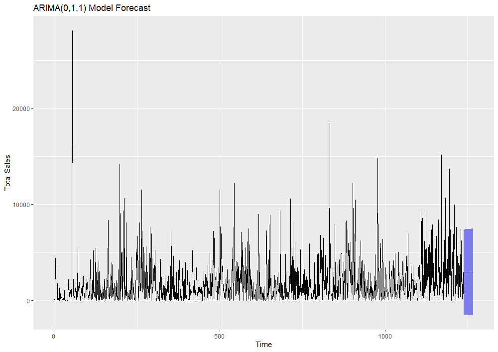
Here, we can see our ARIMA model’s forecasted values in purple. A 95% confidence interval is shaded blue around these forecasts. Although it remains the best model among the three we tested, ARIMA(0,1,1) has difficulty accounting for the high variability and outliers in our historical data. Wide confidence intervals around the model’s predictions reflect its inability to accurately capture seasonality and trends. For this reason, ARIMA models are generally best suited for short-term forecasts.
Prophet Model Forecasting
The last model we will discuss is the Prophet model from Facebook. Prophet was created in 2017 to simplify forecasting and allow for greater customization in modeling specific components of business time series data. As we’ve observed so far, fully automated models can struggle with adapting to components like seasonality, trend changes, and outliers. Prophet allows users to easily incorporate these components for more accurate forecasts. The ability to fine-tune model parameters for specific data patterns makes Prophet a very powerful tool.
Prophet uses three main components in its model: seasonality, trend, and holidays. This model is defined using the following equation:
y(t) = g(t) + s(t) + h(t) + ϵt
Where g(t) is a trend function modeling non-periodic changes, s(t) is a function modeling periodic changes like seasonality, and h(t) is a function modeling holiday effects at irregular intervals (sometimes over one or more days). ϵt is an error term assumed to follow a normal distribution.
Implementation of Prophet is available as open-source software in R and Python. We will continue our exploration by loading the library in R Studio.
library(prophet)
Using functions from this library, we need to format our time series dataframe with two columns: ds and y. ds will contain our dates formatted YYYY-MM-DD. y will hold our daily sales values.
# Reload the sales time series
sales = sales_profit[,1:2] # Eliminating the profit column
names(sales) = c("ds", "y") # Rename columns
head(sales) # Display first 6 rows
| ds | y |
|---|---|
| 2014-01-03 | 16.4 |
| 2014-01-04 | 288.0 |
| 2014-01-05 | 19.5 |
| 2014-01-06 | 4407.0 |
| 2014-01-07 | 87.2 |
| 2014-01-09 | 40.5 |
Next, we’ll call the prophet function to fit the model to our data. We’ll then use the make_future_dataframe and predict functions to predict the next 30 days of sales data.
model = prophet(sales) # Build Prophet model
future = make_future_dataframe(model, periods = 30) # Create dataframe with future ds values
forecast = predict(model, future) # Forecast sales for next 30 days
head(forecast[c('ds', 'yhat', 'yhat_lower', 'yhat_upper')]) # Display next 6 days of forecasted sales
| ds | yhat | yhat_lower | yhat_upper |
|---|---|---|---|
| 2014-01-03 | 1548.0190 | -1314.286 | 4235.268 |
| 2014-01-04 | 1053.2698 | -1689.295 | 3843.975 |
| 2014-01-05 | 1144.7549 | -1626.911 | 3836.048 |
| 2014-01-06 | 1269.8428 | -1650.039 | 4041.167 |
| 2014-01-07 | 612.3520 | -1971.007 | 3394.232 |
| 2014-01-09 | 822.3456 | -1808.667 | 3641.302 |
You can see the predict function gives us forecasted sales for future dates as well as a 95% confidence interval around them. We can display the model’s forecast against our historical dates and future dates.
plot(model, forecast) # Plot model predictions against past & future dates
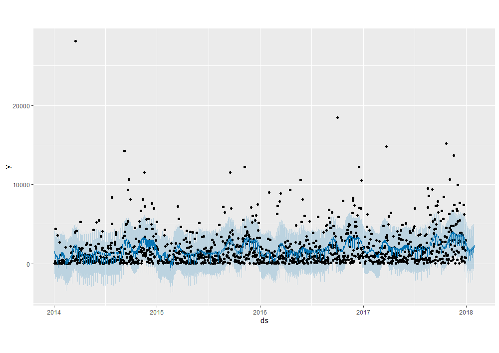
We can see Prophet appears to track seasonality and nuances in the data better than ARIMA. Generally, the solid blue forecast line aligns closely with historical sales values. We also see the 95% confidence interval captures most of the outliers in the data (with the exception of a few drastic sales jumps). The solid blue forecast line & CI extend 30 days into the future as we specified.
Using the prophet_plot_components function, we can take a closer look at trends, weekly seasonality, and yearly seasonality captured in the model.
prophet_plot_components(model, forecast)
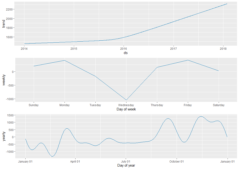
As we expected earlier, the model detected a positive trend in sales over time. Looking at weekly seasonality, we see a large dip in the magnitude of sales (y-axis) on Wednesdays. Likewise, we can observe how sales trend across different times of the year. We see large spikes in sales towards the beginning of March, end of September, and the start of November!
For an even closer look at our forecast, we can create an interactive plot using Dygraphs.
dyplot.prophet(model, forecast)
Hover over the plot above to see actual and predicted data points along with their corresponding dates. To focus on specific periods of interest, use the slider below the plot to adjust the date range.
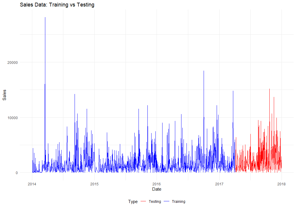
While the Prophet model appears more accurate than ARIMA (our previous model champion), we must confirm with model diagnostic tests to be certain. Rather than comparing diagnostics from model summary functions, we’ll take a slightly modified approach this time around. First, we’ll divide the original time series into training and testing sets. Then, we’ll train ARIMA and Prophet models on the training data and plot their forecasted values against the testing data.
# Split into training & testing data (80% training, 20% testing)
split_point = floor(0.8 * nrow(sales))

# Split into training and testing datasets
train_data = sales[1:split_point, ]
test_data = sales[(split_point + 1):nrow(sales), ]

# Combine training and testing data with a new label column
train_data$Type = "Training"
test_data$Type = "Testing"
combined = rbind(train_data, test_data)

# Plot the split data
ggplot(combined, aes(x = ds, y = y, color = Type)) +
  geom_line() +
  labs(title = "Sales Data: Training vs Testing", x = "Date", y = "Sales") +
  scale_color_manual(values = c("Training" = "blue", "Testing" = "red")) +
  theme_minimal()
Next, we’ll plot a new ARIMA model from the training data over the testing data.
# Train an ARIMA Model
training_arima = auto.arima(sales$y) # Still creates an ARIMA(0,1,1)

# Predict ARIMA forecasted values
arima_forecast = forecast(training_arima, h = nrow(test_data))

# New vector for arima-predicted values
arima_predicted = arima_forecast$mean

# Add an Arima_Predicted column to the combined dataframe & initialize with N/A
combined$Arima_Predicted = NA

# Fill the Arima_Predicted column with arima_predicted values for the test data
combined$Arima_Predicted[combined$Type == "Testing"] = arima_predicted

# Plot combined the predicted values
ggplot() +
  geom_line(data = combined, aes(x = ds, y = y, color = Type), size = 1) +
  geom_line(data = combined[!is.na(combined$Arima_Predicted), ], aes(x = ds, y = Arima_Predicted), color = "black", linetype = "solid", size = 1) +
  labs(title = "Sales Data: Training vs Testing with ARIMA(0,1,1) Forecast", x = "Date", y = "Sales") +
  scale_color_manual(values = c("Training" = "blue", "Testing" = "red")) +
  theme_minimal() +
  guides(color = guide_legend(title = NULL)) +
  theme(legend.position = "bottom")
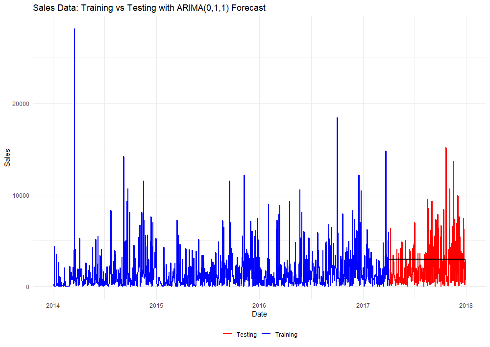
Predicted values from the ARIMA(0,1,1) model appear in black. Again, the forecasted values we see from this model are linear and static. We’ll repeat this same procedure for the Prophet model…
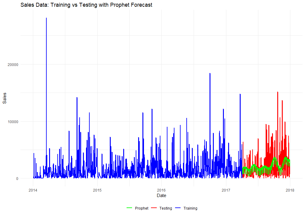
# Repeat procedure for the Prophet (default) model
sales = train_data[,1:2]
names(sales) = c("ds", "y")
m = prophet(sales)
future = make_future_dataframe(m, periods = nrow(test_data))
forecast = predict(m, future)
prophet_predicted = forecast$yhat[990:1237]

# Add a column for Prophet predictions, initializing with NA
combined$Prophet_Predicted = NA

# Assign Prophet predictions to the test data
combined$Prophet_Predicted[combined$Type == "Testing"] <- prophet_predicted

# Plot the original data with Prophet predictions
ggplot() +
  geom_line(data = combined, aes(x = ds, y = y, color = Type), size = 1) +
  geom_line(data = combined[!is.na(combined$Prophet_Predicted), ], aes(x = ds, y = Prophet_Predicted, color = "Prophet"), linetype = "solid", size = 1) +
  labs(title = "Sales Data: Training vs Testing with Prophet Forecast", x = "Date", y = "Sales") +
  scale_color_manual(values = c("Training" = "blue", "Testing" = "red", "Prophet" = "green")) +
  theme_minimal() +
  guides(color = guide_legend(title = NULL)) +
  theme(legend.position = "bottom")
Okay, that’s enough plotting for now. Time to dive into some model diagnostics for comparison!
library(Metrics)
library(MLmetrics)

# ARIMA Model
mse_value = mse(test_data$y, arima_predicted) # Calculate MSE
rmse_value = rmse(test_data$y, arima_predicted) # Calculate RMSE
mae_value = mae(test_data$y, arima_predicted) # Calculate MAE
mape_value = MAPE(y_pred = arima_predicted, y_true = test_data$y) # Calculate MAPE
r2_value = r2(test_data$y, arima_predicted) # Calculate R-squared
mase_value = mase(test_data$y, arima_predicted) # Calculate MASE
smape_value = smape(predicted = arima_predicted, actual = test_data$y) # Calculate sMAPE (Symmetric Mean Absolute Percentage Error)

# Prophet Model
mse_value = mse(test_data$y, prophet_predicted) # Calculate MSE (Prophet)
rmse_value = rmse(test_data$y, prophet_predicted) # Calculate RMSE
mae_value = mae(test_data$y, prophet_predicted) # Calculate MAE
mape_value = MAPE(y_pred = prophet_predicted, y_true = test_data$y) # Calculate MAPE
r2_value = r2(test_data$y, prophet_predicted) # Calculate R-squared
mase_value = mase(test_data$y, prophet_predicted) # Calculate MASE
smape_value = smape(predicted = prophet_predicted, actual = test_data$y) # Calculate sMAPE (Symmetric Mean Absolute Percentage Error)
| Diagnostic Metric | ARIMA(0,1,1) | Prophet | Better Model |
|---|---|---|---|
| MSE | 6363458.45165793 | 6400382.13253398 | ARIMA |
| RMSE | 2522.58963203648 | 2529.89765258083 | ARIMA |
| MAE | 2035.75398421562 | 1809.23701661578 | Prophet |
| MAPE | 10.0397134661968 | 7.40745439363767 | Prophet |
| R2 | -0.0457047638430084 | -0.0517724186071631 | ARIMA |
| MASE | 0.823131108472401 | 0.73154186729987 | Prophet |
| sMAPE | 0.854683605726403 | 0.812536143483654 | Prophet |
Between both models, similar RMSE values indicate comparable performance in terms of overall prediction error. Prophet generally performs better in terms of MAE, MAPE, MASE, and sMAPE, indicating more accurate predictions and better relative performance. ARIMA performs slightly better in MSE and R² but falls short in the other key metrics. Overall, Prophet appears to be the better model for forecasting our daily sales.
As mentioned earlier, the Prophet model is easily adjustable to capture patterns that an automated model might overlook. We observed several peaks and valleys in the magnitude of sales throughout the year in our model components plot above. Using Prophet’s holiday parameter, we can specify seasonal changepoints to the model at different times of the year. Let’s investigate adding different seasonal changepoints to enhance forecast accuracy beyond the base model.
Below is an annotated version of our annual seasonality plot.
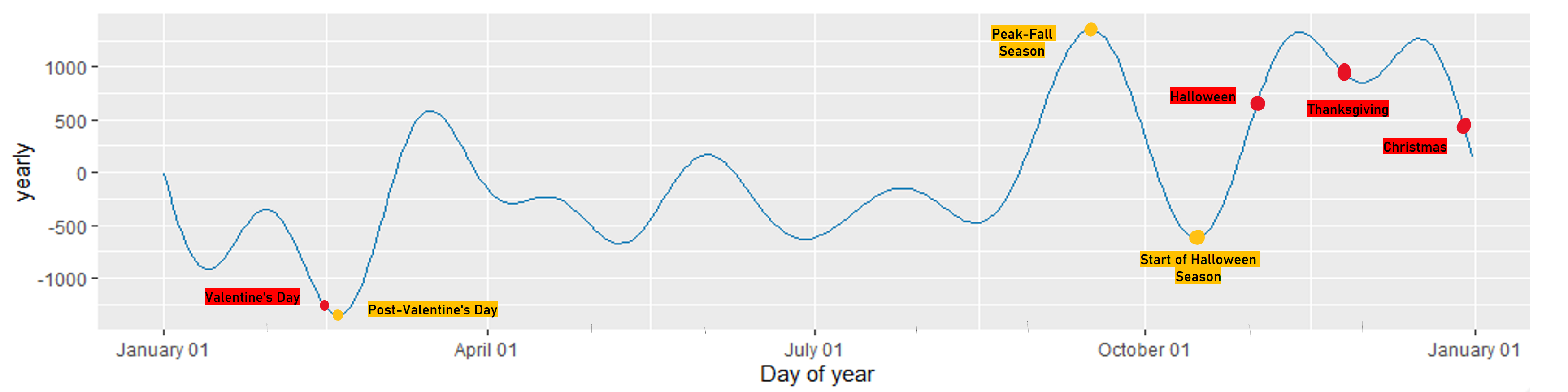
Several popular US holidays are labeled in red, and significant changes to sales magnitude are labeled in yellow. We’ll compare new Prophet models with these seasonal components added.
- Post-Valentine’s Day: There is a large dip in sales magnitude following Valentine’s Day. This could indicate a slowdown in consumer spending after the expensive holiday shopping spike.
- Peak-Fall Season: During the peak of the fall season, there is a significant rise in sales magnitude. This could be due to seasonal shopping trends or preparations for upcoming holidays like Halloween and Thanksgiving.
- Halloween Season: Sales begin to rise weeks before Halloween. This is likely due to early preparations and purchases for the holiday.
- Thanksgiving: There tends to be a decrease in sales magnitude leading up to Thanksgiving. This magnitude increases soon after as we enter the winter holiday season.
- Christmas: Sales magnitude increases in the weeks leading up to Christmas. This peak is followed by a decline as the year transitions into the post-holiday period.
We’ll construct the first Prophet model with an additive component for Thanksgiving.
#  List out all Thanksgiving dates in the training data
thanksgiving = data_frame(
     holiday = 'thanksgiving',
     ds = as.Date(c('2014-11-27', '2015-11-26', '2016-11-24', '2017-11-23')),
     lower_window = 0,
     upper_window = 1
)

# Define the holidays parameter
holidays = thanksgiving # This parameter can hold multiple holidays / changepoints

# Construct a new model with holiday component
m = prophet(sales, holidays = holidays)
future = make_future_dataframe(m, periods = nrow(test_data)) # Build out dataframe for forecasted values
forecast = predict(m, future) # Forecast values for testing data
prophet_predicted = forecast$yhat[990:1237]
combined$Prophet_Predicted = NA
combined$Prophet_Predicted[combined$Type == "Testing"] = prophet_predicted # Assign forecasted values to combined dataframe

# Run model diagnostics (we'll display these in a master table)
print(paste("MSE:", mse_value <- mse(test_data$y, prophet_predicted))) # Calculate and print MSE (Prophet)
print(paste("RMSE:", rmse_value <- rmse(test_data$y, prophet_predicted))) # Calculate and print RMSE
print(paste("MAE:", mae_value <- mae(test_data$y, prophet_predicted))) # Calculate and print MAE
print(paste("MAPE:", mape_value <- MAPE(y_pred = prophet_predicted, y_true = test_data$y))) # Calculate and print MAPE
print(paste("R-squared:",
            r2_value <- 1 - sum((test_data$y - prophet_predicted)^2) / sum((test_data$y - mean(test_data$y))^2)))
print(paste("MASE:", mase_value <- mase(test_data$y, prophet_predicted))) # Calculate and print MASE
print(paste("sMAPE:", smape_value <- smape(predicted = prophet_predicted, actual = test_data$y))) # Calculate and print sMAPE
This code outputs model diagnostics for our new Prophet model with an additive component for Thanksgiving. By modifying the holiday(s), we can build out a diagnostics table for the base model with different additive seasonal components. We’ll bolden the metrics that performed the best for better readability.
| Diagnostic Metric | Prophet (original) | Thanksgiving | Christmas | Halloween Season | Peak Fall Season | Post-Valentines Day | Halloween & Post-Valentines Day | Halloween, Post-Valentines Day & Christmas |
|---|---|---|---|---|---|---|---|---|
| MSE | 6400382.13 | 6399608.10 | 6403317.13 | 6349794.95 | 6486754.90 | 6398750.35 | 6365829.14 | 6382343.11 |
| RMSE | 2529.90 | 2529.74 | 2530.48 | 2519.88 | 2546.91 | 2529.58 | 2523.06 | 2526.33 |
| MAE | 1809.24 | 1816.45 | 1808.29 | 1817.97 | 1822.93 | 1809.66 | 1813.58 | 1809.90 |
| MAPE | 7.41% | 7.45% | 7.37% | 7.61% | 7.43% | 7.42% | 7.50% | 7.39% |
| R-squared | -0.0518 | -0.0516 | -0.0523 | -0.0435 | -0.0660 | -0.0515 | -0.0461 | -0.0488 |
| MASE | 0.7315 | 0.7345 | 0.7312 | 0.7351 | 0.7371 | 0.7317 | 0.7333 | 0.7318 |
| sMAPE | 0.8125 | 0.8123 | 0.8123 | 0.8130 | 0.8134 | 0.8125 | 0.8133 | 0.8134 |
Looking at our results, the Halloween Season additive model is a top performer across multiple metrics (MSE, RMSE, and R²). The Christmas additive model also performed well, but its differences between MAE and MASE with the Halloween Season model are marginal. With that said, we managed to improve the base Prophet model by adding seasonality components for the Halloween season!