Python: Investigating Guest Stars in The Office
Background
This analysis comes from an unguided project offered by DataCamp. In this project, I utilize the Pandas and Matplotlib libraries to create an informative plot of episode data from The Office. The dataset used in this analysis comes from the Kaggle data science community.
Analysis
To begin this project, we can download the pandas and Matplotlib packages and alias them accordingly. We also need to import the CSV file containing the episode data. Once this is accomplished, we can take a look at the first few rows of our dataset.
### Import packages
import pandas as pd
import matplotlib.pyplot as plt

### Preview the data
data = pd.read_csv('datasets/office_episodes.csv')
data.head()
| episode_number | season | title | description | ratings | votes | viewership_mil | duration | release_date | guest_stars | director | writers | has_guests | scaled_ratings |
|---|---|---|---|---|---|---|---|---|---|---|---|---|---|
| 0 | 1 | Pilot | The premiere episode introduces the boss and s… | 7.5 | 4936 | 11.2 | 23 | 2005-03-24 | NaN | Ken Kwapis | Ricky Gervais, Stephen Merchant, and Greg Daniels | False | 0.28125 |
| 1 | 1 | Diversity Day | Michael’s off color remark puts a sensitivity … | 8.3 | 4801 | 6.0 | 23 | 2005-03-29 | NaN | Ken Kwapis | B. J. Novak | False | 0.53125 |
| 2 | 1 | Health Care | Michael leaves Dwight in charge of picking the… | 7.8 | 4024 | 5.8 | 22 | 2005-04-05 | NaN | Ken Whittingham | Paul Lieberstein | False | 0.37500 |
| 3 | 1 | The Alliance | Just for a laugh, Jim agrees to an alliance wi… | 8.1 | 3915 | 5.4 | 23 | 2005-04-12 | NaN | Bryan Gordon | Michael Schur | False | 0.46875 |
| 4 | 1 | Basketball | Michael and his staff challenge the warehouse … | 8.4 | 4294 | 5.0 | 23 | 2005-04-19 | NaN | Greg Daniels | Greg Daniels | False | 0.56250 |
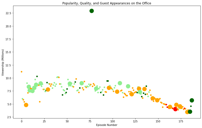
To create a scatter plot, we will plot the episode number along the x-axis and viewership (in millions) along the y-axis for each episode. For each point in the scatter plot, we can introduce a color scheme that reflects the scaled ratings of each episode.
- Ratings < 0.25 are colored
red. - Ratings ≥ 0.25 and < 0.50 are colored
orange. - Ratings ≥ 0.50 and < 0.75 are colored
lightgreen. - Ratings ≥ 0.75 are colored
darkgreen.
### Set plot color based on scaled ratings
ratings_col = data.loc[:, 'scaled_ratings']
col_scheme = []

for i in range(len(ratings_col)):
    if ratings_col[i] < 0.25:
        col_scheme.append('red')
    elif ratings_col[i] >= 0.25 and ratings_col[i] < 0.5:
        col_scheme.append('orange')
    elif ratings_col[i] >= 0.5 and ratings_col[i] < 0.75:
        col_scheme.append('lightgreen')
    else:
        col_scheme.append('darkgreen')
Next, we can create a sizing system for points in the scatter plot such that…
- episodes with guest appearances have a marker size of 250
- episodes without guest appearances are sized 25
### Set plot sizing based on guest appearances
sizing = []
guest_col = data.loc[:,'has_guests']

for j in range(len(guest_col)):
    if guest_col[j] == True:
        sizing.append(250.0)
    else:
        sizing.append(25.0)
Finally, we can display the scatter plot.
### Plot figure
fig = plt.figure()
plt.scatter(data['episode_number'], data['viewership_mil'], color=col_scheme, s=sizing)
plt.title('Popularity, Quality, and Guest Appearances on the Office')
plt.xlabel('Episode Number')
plt.ylabel('Viewership (Millions)')
plt.show()

There appears to be a notable downward trend in viewership after the 125th episode of the show. Further, it is clear that the most watched episode of The Office had at least one guest appearance and was highly rated ( > 0.75). We can easily find which guest stars made an appearence in this episode.
### Identify top stars
most_viewed = data[data.loc[:,'viewership_mil']==max(data.loc[:,'viewership_mil'])]
print(most_viewed['guest_stars'])
77    Cloris Leachman, Jack Black, Jessica Alba
Name: guest_stars, dtype: object
Cloris Leachman, Jack Black, and Jessica Alba all made an appearence in the most watched episode of the show. This may explain why this episode was so popular!
