
Python: Predicting Employee Salary with Machine Learning
Background
The dataset in this project explores factors that influence employee performance and satisfaction. I investigate how different variables influence employee salary. I then create and test machine learning models to predict employee salary from the data. The Employee Productivity and Satisfaction HR Data was imported from Kaggle. All Python code was run in a Jupyter Notebook environment.
Exploratory Analysis
We begin by importing the required libraries and dataset.
# Import required libraries
import pandas as pd
import numpy as np
import matplotlib.pyplot as plt
import seaborn as sns
import missingno as msno
import plotly.express as px
from sklearn import preprocessing
from sklearn.preprocessing import StandardScaler

# Load dataset
df = pd.read_csv("C:/Users/ethan/OneDrive/Documents/Data Glacier/datasets/hr_data.csv")
df.shape
(200, 11)
This dataset contains 200 employee records with 11 informative variables. We can print the first 6 rows of the dataset to get a better sense of these variables.
df.head(6)
| Name | Age | Gender | Projects Completed | Productivity (%) | Satisfaction Rate (%) | Feedback Score | Department | Position | Joining Date | Salary |
|---|---|---|---|---|---|---|---|---|---|---|
| Douglas Lindsey | 25 | Male | 11 | 57 | 25 | 4.7 | Marketing | Analyst | Jan-20 | 63596 |
| Anthony Roberson | 59 | Female | 19 | 55 | 76 | 2.8 | IT | Manager | Jan-99 | 112540 |
| Thomas Miller | 30 | Male | 8 | 87 | 10 | 2.4 | IT | Analyst | Jan-17 | 66292 |
| Joshua Lewis | 26 | Female | 1 | 53 | 4 | 1.4 | Marketing | Intern | Jan-22 | 38303 |
| Stephanie Bailey | 43 | Male | 14 | 3 | 9 | 4.5 | IT | Team Lead | Jan-05 | 101133 |
| Jonathan King | 24 | Male | 5 | 63 | 33 | 4.2 | Sales | Junior Developer | Jan-21 | 48740 |
All variables are relatively easy to comprehend. It is important to note that Projects Completed represents the total number of projects completed out of 25. We are left to assume that all projects hold the same amount of difficulty, regardless of employee position. Next, we will check to see if there are any missing values in the dataset.
df.isnull().sum()
Name                     0
Age                      0
Gender                   0
Projects Completed       0
Productivity (%)         0
Satisfaction Rate (%)    0
Feedback Score           0
Department               0
Position                 0
Joining Date             0
Salary                   0
dtype: int64
There are no missing values in any of the columns. Further, we can look at the data type of each column in the dataset.
df.info()
<class 'pandas.core.frame.DataFrame'>
RangeIndex: 200 entries, 0 to 199
Data columns (total 11 columns):
 #   Column                 Non-Null Count  Dtype
---  ------                 --------------  -----
 0   Name                   200 non-null    object
 1   Age                    200 non-null    int64
 2   Gender                 200 non-null    object
 3   Projects Completed     200 non-null    int64
 4   Productivity (%)       200 non-null    int64
 5   Satisfaction Rate (%)  200 non-null    int64
 6   Feedback Score         200 non-null    float64
 7   Department             200 non-null    object
 8   Position               200 non-null    object
 9   Joining Date           200 non-null    object
 10  Salary                 200 non-null    int64
dtypes: float64(1), int64(5), object(5)
memory usage: 17.3+ KB
To see more information, we can look at summary statistics for each column in the dataset.
df.describe()
| Age | Projects Completed | Productivity (%) | Satisfaction Rate (%) | Feedback Score | Salary | |
|---|---|---|---|---|---|---|
| count | 200.000000 | 200.000000 | 200.000000 | 200.000000 | 200.000000 | 200.000000 |
| mean | 34.650000 | 11.455000 | 46.755000 | 49.935000 | 2.883000 | 76619.245000 |
| std | 9.797318 | 6.408849 | 28.530068 | 28.934353 | 1.123263 | 27082.299202 |
| min | 22.000000 | 0.000000 | 0.000000 | 0.000000 | 1.000000 | 30231.000000 |
| 25% | 26.000000 | 6.000000 | 23.000000 | 25.750000 | 1.900000 | 53080.500000 |
| 50% | 32.000000 | 11.000000 | 45.000000 | 50.500000 | 2.800000 | 80540.000000 |
| 75% | 41.000000 | 17.000000 | 70.000000 | 75.250000 | 3.900000 | 101108.250000 |
| max | 60.000000 | 25.000000 | 98.000000 | 100.000000 | 4.900000 | 119895.000000 |
df.describe(include='object')
| Name | Gender | Department | Position | Joining Date | |
|---|---|---|---|---|---|
| count | 200 | 200 | 200 | 200 | 200 |
| unique | 200 | 2 | 5 | 6 | 25 |
| top | Douglas Lindsey | Male | Sales | Manager | Jan-18 |
| freq | 1 | 100 | 47 | 40 | 23 |
Name is not an important variable for this analysis, so we can remove it from the dataframe.
df=df.drop(['Name'],axis=1)
df.shape
(200, 10)
We now have 200 employee records with 10 informative variables. Next, we will define a density plot function to visualize variable distributions in the dataset.
# Define a density plot function
def den_plot(data):
    sns.kdeplot(x=df[data], fill=True)
    plt.gcf().set_size_inches(10,4)
plt.subplots(1,2,sharey=True)
plt.subplot(1,2,1)
den_plot('Age')
plt.subplot(1,2,2)
den_plot('Projects Completed')
plt.subplots(1,2, sharey=True)
plt.subplot(1,2,1)
den_plot('Productivity (%)')
plt.subplot(1,2,2)
den_plot('Satisfaction Rate (%)')
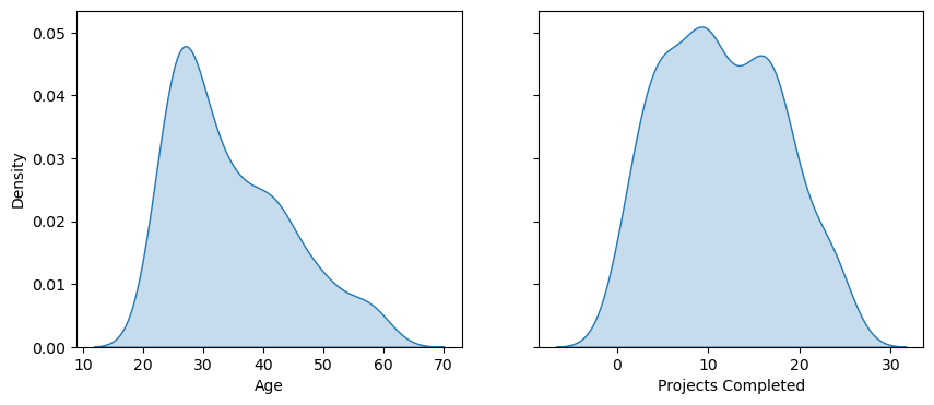
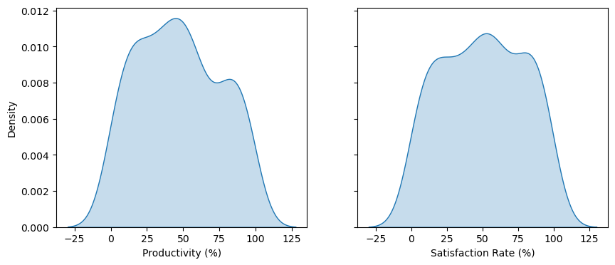
All variable distributions look approximately normal. Age is slightly skewed right. A boxplot can be used to detect potential outliers in Age.
fig = px.box(df, y = 'Age', points = 'outliers')
fig.update_layout(hovermode='x')
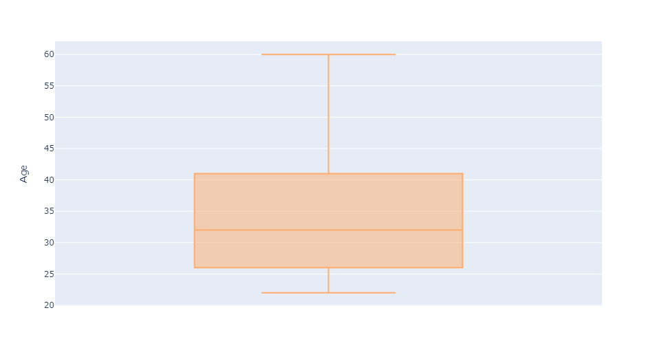
Age has no outliers.
Investigating Gender
In some organizations, gender has been identified as an influence on employee salary. We can investigate whether this occurrence holds true in our dataset. First, we will look at the distribution of gender across all employees.
fig = px.pie(sex, values='Count', names='Gender', color_discrete_sequence=['lightblue', 'pink'])
fig.show()
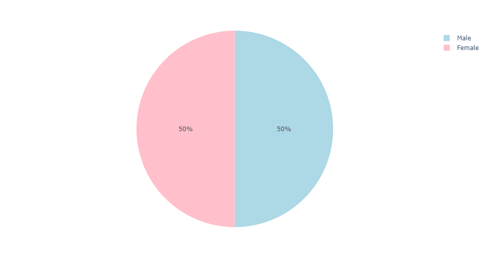
We can see that the distribution of gender is split evenly. That is, there are exactly 100 male and 100 female employees. Next, we will compare the average salaries of male and female employees at this organization.
mean_salary = df.groupby('Gender').mean(numeric_only=True)['Salary'].reset_index()
mean_salary['Label'] = '$' + mean_salary['Salary'].apply(lambda x: f'{x:.0f}')
mean_salary.columns = ['Gender', 'Average Salary', 'Label']
fig = px.bar(mean_salary, x='Gender', y='Average Salary', text='Label', labels = {'Average Salary': 'Average Salary ($)'}, color='Gender', color_discrete_sequence=['pink', 'lightblue'])
fig.update_traces(textposition='inside', textfont=dict(size=14), insidetextanchor='middle')
fig.update_traces(width=0.4)
fig.show()
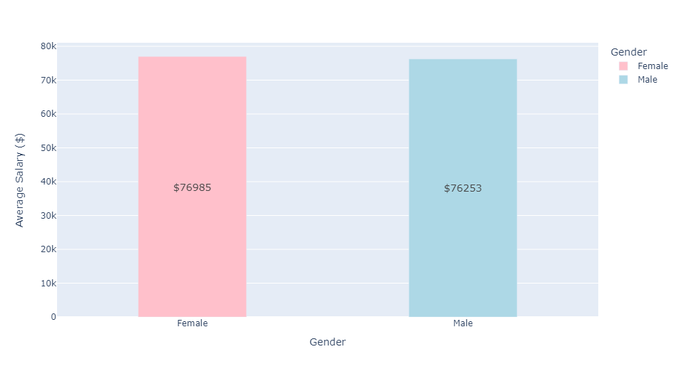
The average salaries for male and female employees are approximately equivalent. Next, we will plot the average salaries for both genders over time. This will require reformatting Joining Date in the dataset. We will extract the year information from Joining Date and hold these values in a new list. This new list of years (integers) will then be reassigned to Joining Date. Additionally, we will create a new data frame to hold gendered average salaries for each year. We will visualize this data with a line plot.
# Create a new list to extract the join year
join_year = []
for i in df['Joining Date'].str.split('-'):
    if int(i[1]) < 23:
        join_year.append('20'+str(i[1]))
    else:
        join_year.append('19'+str(i[1]))

# Reassign this list to df['Joining Date']
df['Joining Date'] = pd.Series(join_year).astype(int)

# Calculate average salary for each join year
avg_annual_sal = df.groupby('Joining Date').mean(numeric_only=True)['Salary'].reset_index()
avg_annual_sal.columns = ['Year', 'Average Salary']

# Split average annual salary by gender
female_aas = avg_annual_sal[avg_annual_sal['Gender']=='Female']
female_aas = female_aas.drop(['Gender'], axis=1)
female_aas.columns = ['Year', 'Female']

male_aas = avg_annual_sal[avg_annual_sal['Gender']=='Male']
male_aas = male_aas.drop(['Gender'], axis=1)
male_aas.columns = ['Year', 'Male']

# Combine gendered salaries into a shared dataframe
gendered_aas = pd.merge(male_aas,female_aas,on='Year')

# Plot average annual salaries
fig = px.line(gendered_aas, x='Year', y=['Male', 'Female'], title='Average Salary by Year', labels={'value':'Average Salary'})
fig.update_xaxes(tickangle=45)
fig.show()
Average salaries for both genders follow a relatively similar trend. Neither gender has had a dominant impact on average salary over the past 20 years. We will take one additional look at Gender and Salary by creating a boxplot to visualize gendered salary distributions across Position.
px.box(df,x='Position',y='Salary',color='Gender')
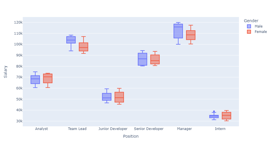
Results from this boxplot can be easily understood. For either gender, managers at this company have the highest average salaries. Alternatively, interns of either gender have the lowest average salaries. There is one outlier in male intern salaries, but this salary still falls below the second-lowest paid position.
Variable Correlation
We will now create a correlation heatmap for variables in the dataset. Categorical variables must be assigned numeric values, which can be achieved by using a label encoder.
LE = preprocessing.LabelEncoder()

# Assign a binary value for Gender
df['Gender'] = LE.fit_transform(df['Gender'])

# Assign unique numeric values for each Department
df['Department'] = LE.fit_transform(df['Department'])

# Assign unique numeric values for each Position
df['Position'] = LE.fit_transform(df['Position'])

# Plot the correlation heatmap
plt.figure(figsize=(10, 8))
sns.heatmap(df.corr(numeric_only=True), annot=True)
plt.title("Variable Correlation")
plt.show()
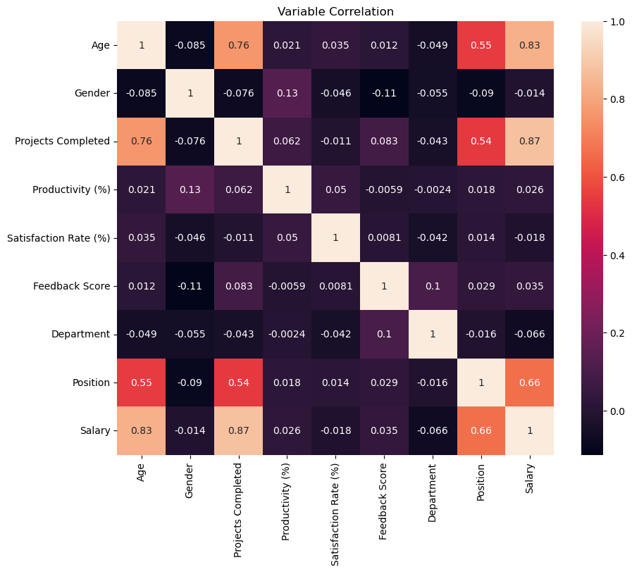
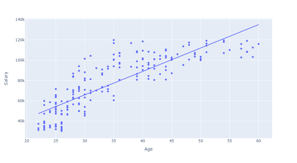
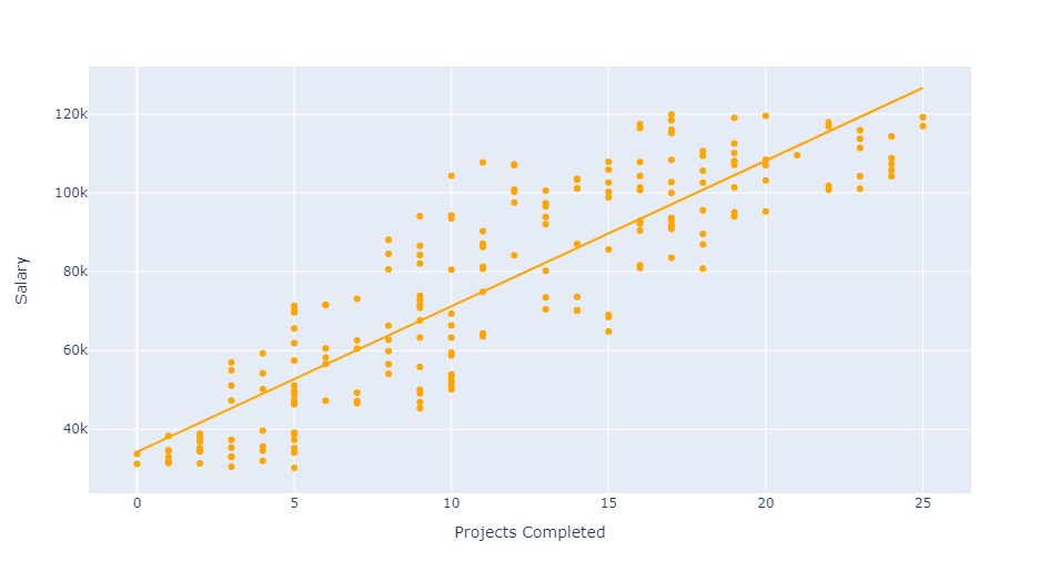
Age and Projects Completed are highly correlated with Salary. This can be further illustrated using scatter plots. We will add an ordinary least squares regression line in each plot to highlight positive correlation between variables.
px.scatter(df, x='Age', y='Salary', trendline='ols')
px.scatter(df, x='Projects Completed', y='Salary', trendline='ols', color_discrete_sequence=['Orange'])
It is time to take a closer look at Position and Department. We will investigate how these variables influence average employee salary. To begin, we will use a simple bar chart to visualize average employee salary by Department.
dept = df.groupby('Department').mean(numeric_only=True)['Salary'].reset_index()
fig = px.bar(dept, x='Department', y='Salary', color='Department', color_discrete_sequence=px.colors.sequential.Rainbow)
fig.update_layout(title_text='Average Salary by Department', xaxis_title='Department', yaxis_title='Salary')
fig.show()
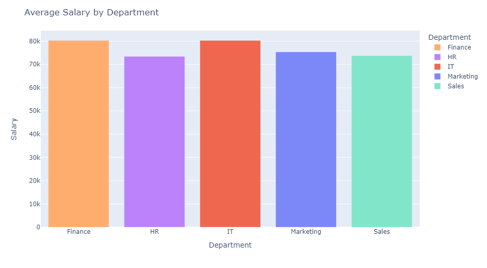
We find that employees with the highest average salaries tend to work in the Finance and IT departments. Employees with the lowest average salaries work in the HR department. While there are some minor discrepancies, the distribution of average employee salary across all departments is fairly uniform.
px.box(df,x='Position',y='Salary',color='Department')
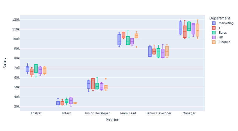
This last boxplot depicts interactions between Department, Position, and Salary. We find that, depending on the department, positional salaries can be quite different. For instance, the median salary for a Team Lead in Finance is much higher than that of the same position in Marketing.
Machine Learning: Predicting Employee Salary
In this section, we deploy four machine learning models to predict employee salary using information from the dataset. We will then test and compare performance metrics to select the best model. To begin, we will import the following libraries.
from sklearn.model_selection import train_test_split
from sklearn.linear_model import LinearRegression
from sklearn.ensemble import RandomForestRegressor
from sklearn.tree import DecisionTreeRegressor
from xgboost import XGBRegressor
from sklearn import metrics
Before fitting any models on the data, it will be helpful to rescale Salary values. Standardizing these values will help us better understand the accuracy of the machine learning models.
# Create scaling object from sklearn.preprocessing
scaler = StandardScaler()

# Standardize Salary values
df[['Salary']] = scaler.fit_transform(df[['Salary']])

# Show updated salary column
print(df['Salary'])
0     -0.482083
1      1.329684
2     -0.382285
3     -1.418358
4      0.907429
         ...
195   -0.983481
196   -1.110783
197   -1.614956
198    1.021553
199    1.026180
Name: Salary, Length: 200, dtype: float64
We can observe the values of Salary have been rescaled to fit a standard normal distribution. Again, this will be helpful when assessing model performance metrics. We will now sort this dataset into training and testing data for machine learning. 80% of the data will be labeled as training data and the remaining 20% will be labeled as testing data.
# Initialize independent and dependent variables
X = df.drop(['Salary'], axis=1)
y = df['Salary']

# Assign test and training data
X_train, X_test, y_train, y_test = train_test_split(X, y, train_size = 0.8, random_state = 123)
We will start by creating a linear regression model from our training data. Linear regression provides coefficient values that can be used to understand the impact of each predictor variable on the target variable Salary. It is important to note that this model will assume a linear relationship between the predictor variables and Salary.
# Fit a linear regression model
LR = LinearRegression()
LR.fit(X_train, y_train)

# Predict salary from test data
y_pred_lr = LR.predict(X_test)
A random forest model will be able to handle non-linearity between predictor variables and Salary. It is a generally robust model and is less prone to overfit the data.
# Fit a random forest model
RF = RandomForestRegressor(n_estimators=500, random_state=123)
RF.fit(X_train, y_train)

# Predict salary from test data
y_pred_rf = RF.predict(X_test)
A decision tree model can handle non-linearity and interactions between features. A single decision tree might not generalize well to unseen data, but default parameters will prevent this issue.
# Fit a decision tree model
DT = DecisionTreeRegressor(random_state=123)
DT.fit(X_train, y_train)

# Predict salary from testing data
y_pred_dt = DT.predict(X_test)
Finally, we will deploy an XGBoost regression model that utilizes gradient boosting. XGBoost provies a powerful model that works well with a variety of data types. This model may require hyperparameter tuning for later improvement. We will set the number of gradient boosted trees to 500.
# Fit an XGBoost Regression Model
XGB = XGBRegressor(n_estimators=500, random_state=22)
XGB.fit(X_train, y_train)

# Predict salary from testing data
y_pred_xgb = XGB.predict(X_test)
We will now take a look at the accuracy of these models by comparing predicted salaries with the testing data.
# Define dictionaries to identify models
key = {0:'lr', 1:'rf', 2:'dt', 3:'xgb'}
name = {0:'Linear Regression', 1:'Random Forest', 2:'Decision Tree', 3:'XGBoost'}

# Format plot
plt.figure(figsize=(10, 10))
plt.subplots_adjust(hspace=0.4, wspace=0.4)

# Plot predicted salary vs actual salary
with plt.rc_context({'xtick.color':'grey','ytick.color':'grey'}):
    for i in range(4):
        plt.subplot(2,2,(i+1))
        sns.scatterplot(x=y_test, y=globals().get('y_pred_' + key[i]))
        sns.regplot(x=y_test, y=globals().get('y_pred_' + key[i]), scatter=True, scatter_kws = {"color": "g"}, line_kws = {"color": "orange", "alpha":0.5})
        plt.xlabel('Actual Salary')
        plt.ylabel('Predicted Salary')
        plt.title(name[i], fontsize=16)
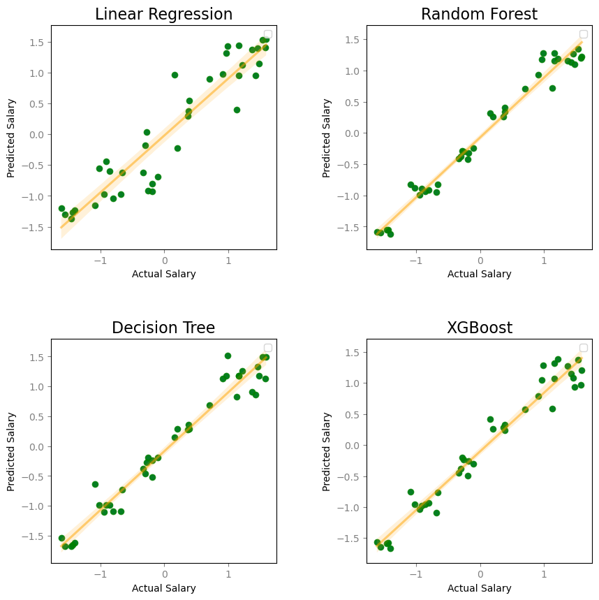
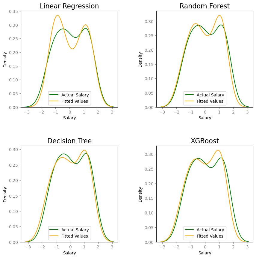
All four models have a clear positive correlation between the predicted and actual values of Salary. An ordinary least squares regression line is included in each scatter plot to emphasize this trend. The random forest model appears to have the best prediction values for salary. Additionally, we can create density plots to visualize the fit of model values on Salary.
plt.figure(figsize=(10, 10))

plt.subplots_adjust(hspace=0.4, wspace=0.4)

with plt.rc_context({'xtick.color':'grey','ytick.color':'grey'}):
    for i in range(4):
        plt.subplot(2,2,(i+1))
        ax = sns.kdeplot(y_test, color="g", label="Actual Salary")
        sns.kdeplot(globals().get('y_pred_' + key[i]), color="orange", label="Fitted Values", ax=ax)
        plt.legend()
        plt.title(name[i], fontsize=16)
Next, we will construct a table to compare performance metrics for each model.
The Mean Squared Error measures an average of the squared differences between the estimated values and actual values of Salary. A lower mean squared error indicates that model predictions are closer to the actual values on average, which is a measure of accuracy.
The Mean Absolute Error is another measure of model error between these paired observations. As it follows, a lower mean absolute error indicates better accuracy in predicting Salary.
The Coefficient of Determination (R-squared) measures the proportion of variance in Salary that is explained by the model. These values usually range from 0 to 1. A model with a higher coefficient of determination provides a better fit to the data.
The Adjusted Coefficient of Determination (Adjusted R-squared) accounts for overfitting by penalizing the addition of independent variables to a model. Similar to R-squared, an adjusted R-squared value close to 1 indicates a good model fit.
# Initialize Table Columns
results = {'Model':[], 'Mean Squared Error':[], 'Mean Absolute Error':[], 'R-squared':[], 'Adjusted R-squared':[]}

# Store models in a list
models = [LR, RF, DT, XGB]

# Fill in table values
for i in range(4):
    results['Model'].append(name[i])

for mod in models:
    # Fit model
    mod.fit(X_train, y_train)
    y_pred = mod.predict(X_test)

    # Metric calculations
    mse = metrics.mean_squared_error(y_test, y_pred)
    mae = metrics.mean_absolute_error(y_test, y_pred)
    r2 = metrics.r2_score(y_test, y_pred)
    adj_r2 = 1-(1-r2)*(len(y_train)-1)/(len(y_train)-X_train.shape[1]-1)

    results['Mean Squared Error'].append(mse)
    results['Mean Absolute Error'].append(mae)
    results['R-squared'].append(r2)
    results['Adjusted R-squared'].append(adj_r2)


table = pd.DataFrame(results)
| Model | Mean Squared Error | Mean Absolute Error | R-squared | Adjusted R-squared |
|---|---|---|---|---|
| Linear Regression | 0.127851 | 0.279753 | 0.878521 | 0.871232 |
| Random Forest | 0.033916 | 0.144999 | 0.967774 | 0.965840 |
| Decision Tree | 0.054168 | 0.172992 | 0.948531 | 0.945443 |
| XGBoost | 0.056552 | 0.186158 | 0.946266 | 0.943042 |
The random forest model is the best of the four models. It has the lowest mean squared error and lowest mean absolute error of the models. The random forest model also has the greatest standard and adjusted coefficients of determination (R-squared and Adjusted R-squared).